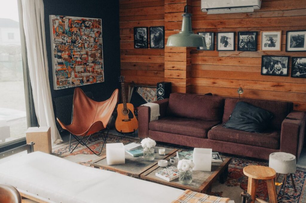
Following in the footsteps of our sister post “Invoking Color ~ Hues,” color (even the debatable kind as we’ll discuss further) plays a huge role in our lives. As I illustrated with our primary and secondary sisters, adding color is not always about making a bold statement. There are many ways it enters our spaces, even subtly, and impacts our mood and environment. Even the most neutral of colors still has strong symbolism. Therefore, we should still look at proper balance and use of neutrals in creating a positive atmosphere for ourselves.
Neutrals ground us.
When we think of colors that ground us in nature, some may drift toward blues, greens, or even yellows. These colors remind us of plants, water, and the sun that provides nourishment and vitality. Neutrals however also come in very earthy tones. Comprising of browns, beiges, grays, white, and black, neutrals also connect us to nature. The corresponding elements of wood, stone, sand, and soil all play a critical role in grounding us – connecting our mind and body with our environment.

Photo by Lisha Riabinina
Here we’ll explore the world of neutrals, and how their presence impacts our spaces. Some may use the term “blank slate” when describing a lack of colorful enhancement in a space. However, when it comes to emotions and senses, even with neutrals there’s no such thing! Less vibrancy or bold detail in a space might make one person feel bored or uninspired, while it makes another feel calm and orderly. Everyone has their personal connections to color, and therefore their own experience. I can’t express enough… let the following act as a guide, but no matter what a color symbolizes, always follow your heart. Your space is first and foremost for you!
BLACK ~ sophistication, strength

Photo by Lou Batier 
Photo by Rui Silva
Describing the color black is a gray area (pun intended!). In a technical sense, black (and white) are not always considered colors. Black is a shade, not a hue. When viewing electronic devices, the colors you see are created by photons of light and black is the absence of light; therefore, it would not be a color. However, when considering pigments and molecules such as on an object like a crayon, black is indeed a color. Whichever theory you want to follow is fine by me! Either way, it doesn’t change the fact that the appearance of a color (or lack there of) still evokes feelings and affects how we react to our environment.
Fun fact: Scientists have found that 62 – 90% of a first impression is based on how someone recognizes color in a situation. Color has a stronger appeal to the senses, and studies have shown that black and white images are harder to recall.
Black has a strong association with the qualities of power and clarity. This is why it is the color of choice for ceremonies such as graduations and court robes, or even the well-known “power suit” in business and “LBD (little black dress)” in evening wear. These qualities are especially apparent when black is used in a space with high contrast, sleek surfaces, or metallics. However, the space can appear cold and oppressive without proper balance of elements and textures added throughout.
Black is also a very elegant color. When paired with neutrals and woods, black presents more depth and sophistication. Whether you’re in a modern sleek environment, or a traditional cozy one, both instances can be very glamourous through their own styles. Accents of gold will enhance the elegance, while silver lends to more seriousness.
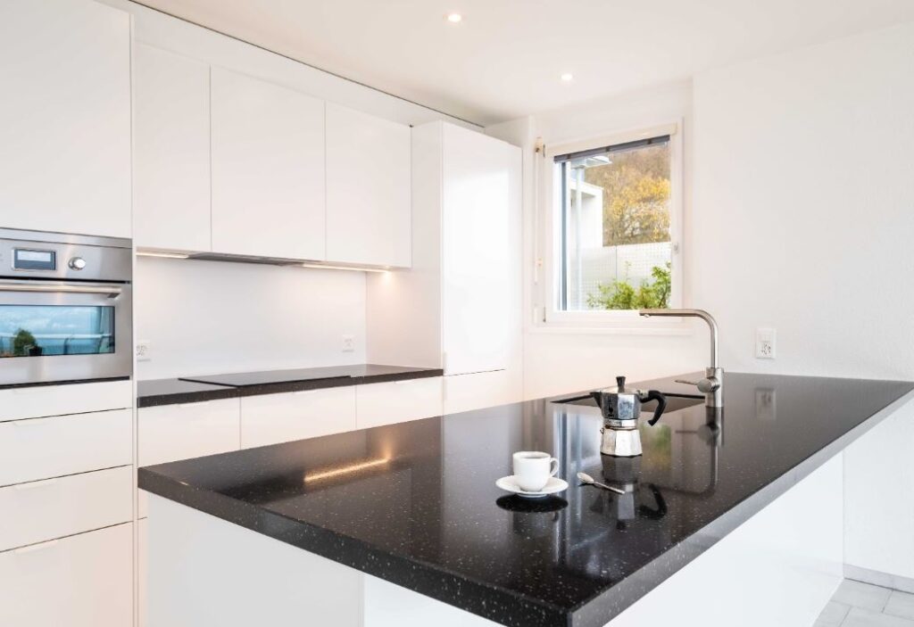
Photo by Daniela Gisin-Krumsick 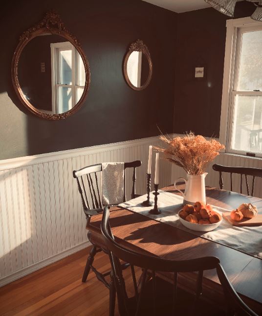
Photo by Erica Marsland Huynh

On a side note, in today’s day and age, black is present around the home even when we aren’t trying to make a statement. Televisions and other electronics, when not designed with purpose, end up all but sophisticated. In such cases, you can actually use more black to hide or blend your objects into your space.
However, be aware that too much black can be dark and depressing. Only use heavy black in an area with ample natural light.
WHITE ~ purity, cleanliness
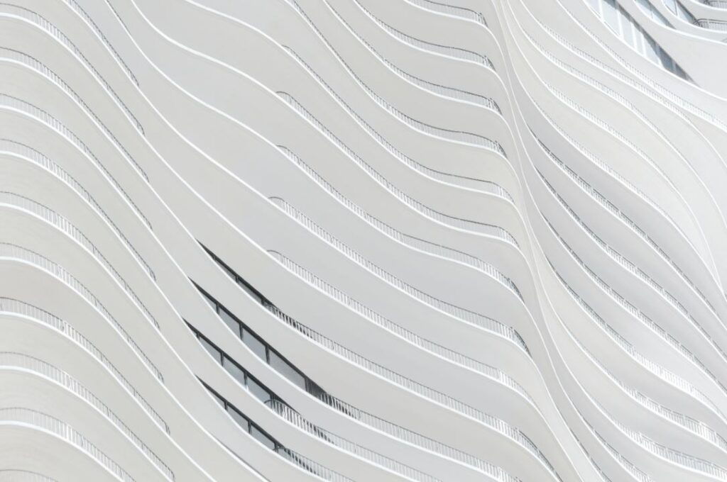
Photo by Christian Perner 
Photo by Ernesta Vala
White as a color gets some mixed viewpoints, such as with black. It is technically a tint, not a hue. However, it has molecular makeup like in a crayon, and a combination of all colors when considering light. So for arguments sake, it’s a color in my book!
White is pleasantly conformable in design. Depending on the materials and shapes used, a strong application can resemble anything from ultra modern to farmhouse chic. White’s characteristics of purity and cleanliness scream “kitchen,” which is why white is still a popular base there. However, blended with other neutrals, it’s an adaptable look for any space and style.
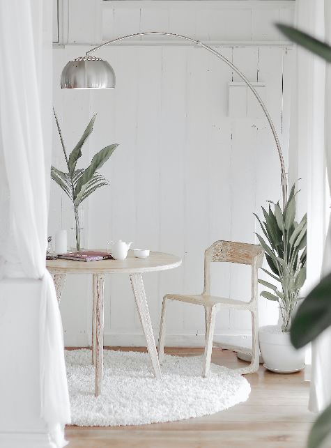
Photo by Hutomo Abrianto 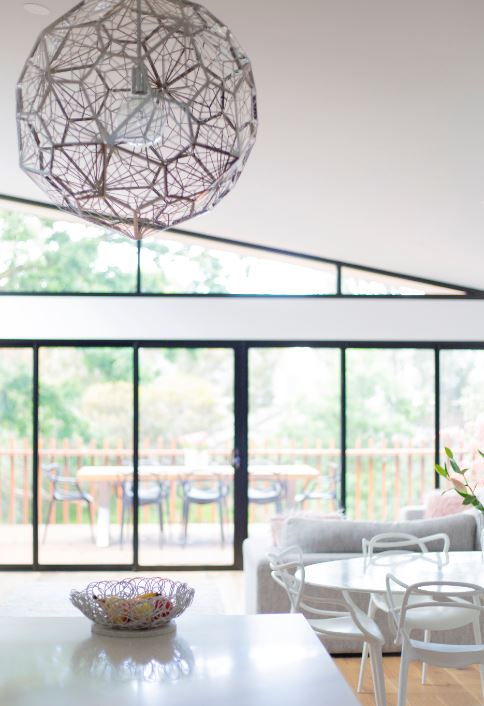
Photo by Simona-Sergi
Whites really brighten a space, and also add a sense of simplicity and openness. Surrounding yourself with white can bring mental clarity and a feeling of peace and innocence. Similar to black however, white can appear cold and stark without the proper balance and variance of materials and textures. The addition of mixed neutrals and elements (i.e. metals, woods, etc), can counter this effect.
In addition to a more neutral use of white in a space, adding just one accent color can create a significant impact. This pop of color will draw your eye directly to the object or area. As a result, this can be a great method for showing off prized possessions or showcasing the best features of a space.
GRAY ~ mature, conservative
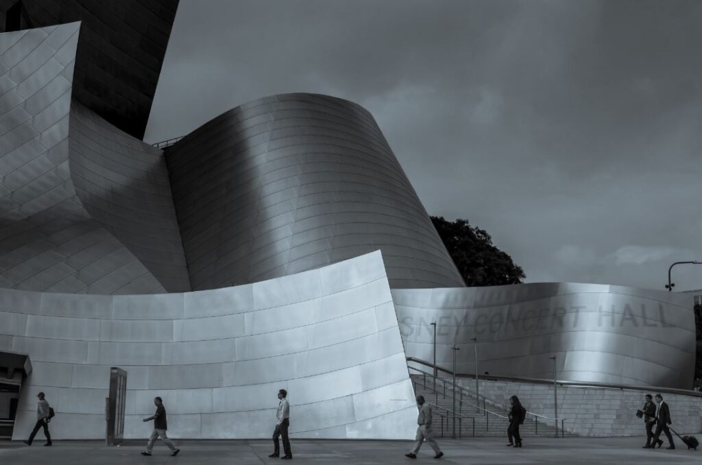
Photo by Anthony Menecola 
Photo by Pavel Neznanov
Gray may indeed be a combination of both white and black, but this color stands alone when it comes to appearance and symbolism. Grays play well with neutrals and really any other color, without the stark contrast of white or black. Gray is more calming and conservative, and adds a blanket of smooth sophistication to a space.
Grays can debut as a full blown backdrop to a space, bringing conventionality and stability. This has grown in popularity and can be accomplished through various styles. Using cement or steel furnishings, gray can lend a more masculine or authoritative stance. Through soft and classic upholstery on the other hand, more feminine and refined characteristics come forward.
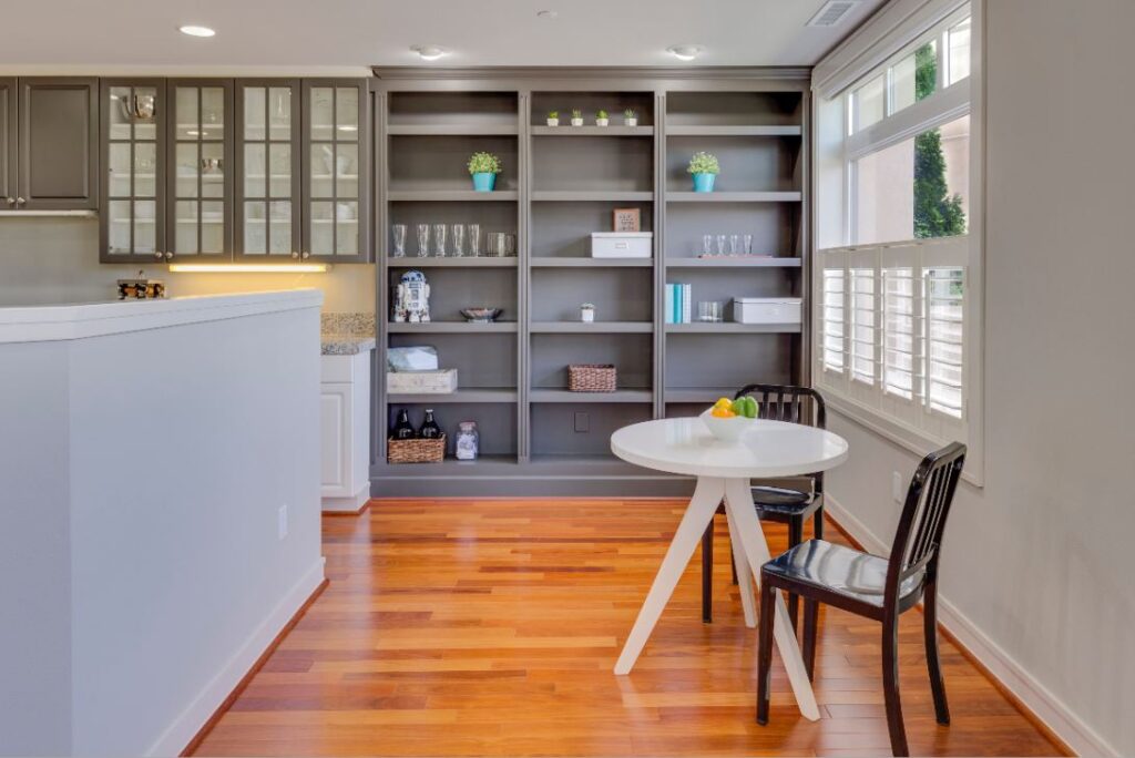
Photo by Francesca Tosolini 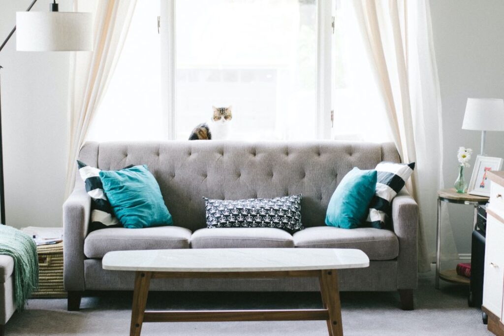
Photo by Nathan Fertig
Whether bringing a bit of old or new flair, the same characteristics of practicality and dignity take center stage when grays come into play.
BROWN ~ comfort, reliability

Photo by Jan Kopriva 
Photo by Joel & Jasmin Forestbird 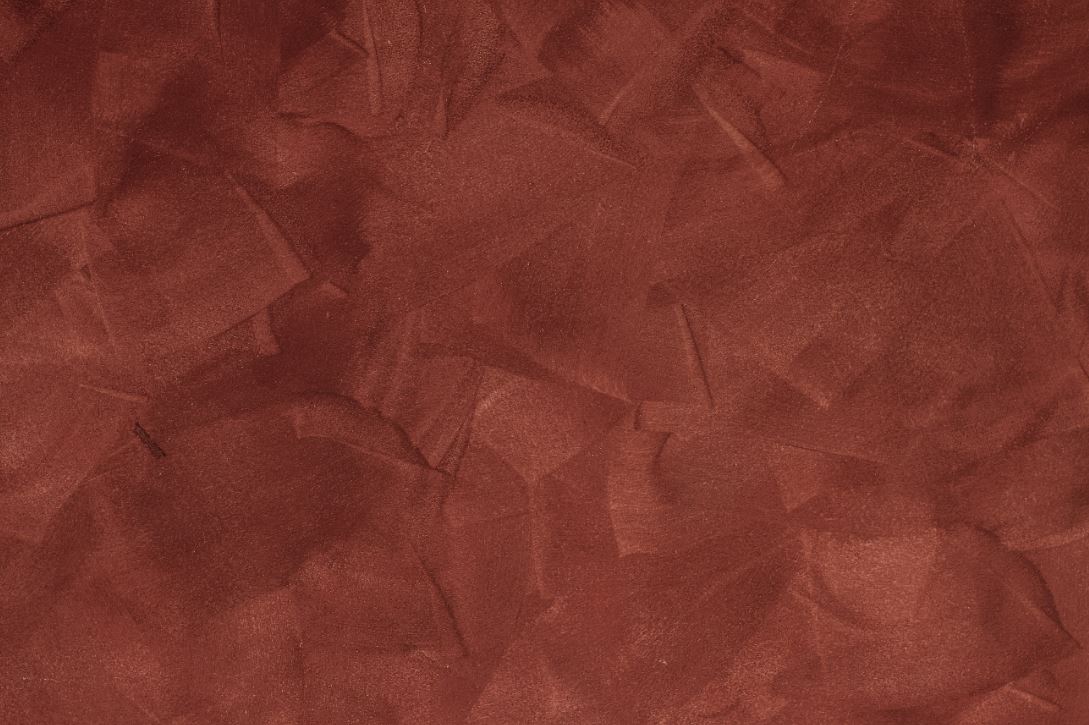
Photo by Valentin Salja
The color brown is extremely versatile. Unlike black and white, browns come in a variety of hues. Browns encompass the span of beiges and reddish clays, in addition to earthy and chocolatey hues. Therefore, the characteristics of brown in your environment can vary significantly.
The colors in the brown family lend themselves to a more comforting ambiance. Even colors in the coral or burgundy family can have a close association with the comfort of browns, especially when paired with other neutrals.
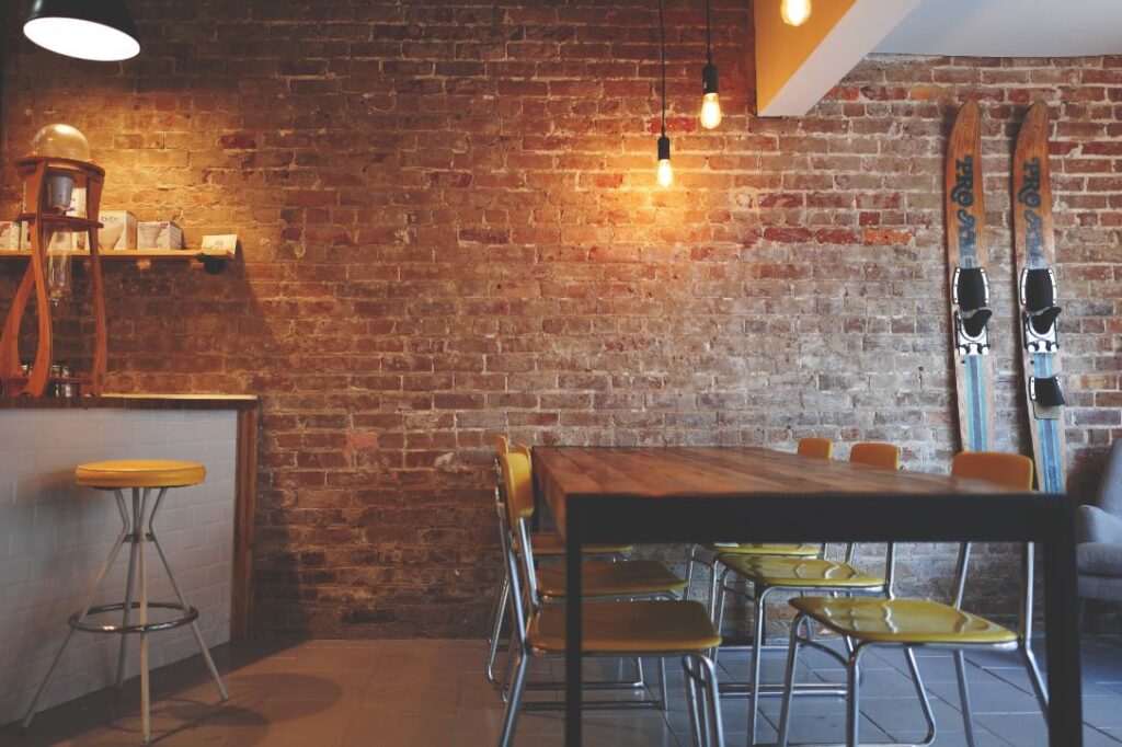
When designing with browns, it’s important to pay attention to the objects, materials, and various hues within your space. This will give you a better understanding of the symbolism you’re producing. In a very industrial style, with brick as a base, a space will exude the characteristics of strength and stability. Having wooden walls or furniture however, will lend itself to more wholesome and comforting tones.
No matter your style, browns can play a part to instill a coziness to the atmosphere or balance out a space that’s too cold or aggressive. Make sure to add some variety in color or contrast however, or else chances are your space will just feel dull and predictable.
Let there be light!
A white or neutral palette brightens a space up, but you still need to see how it appears in different light to understand its effects. Observe your space at different times of the day, and you may find that without enough natural or artificial lighting, a neutral space can lack depth or visual interest. Try incorporating different types of lighting, such as lamps, wall sconces, and ceiling lights. A mixture is even better! Reflective materials such as mirrors and high gloss finishes are another great way to enhance the ambiance and brighten the space as well.
Neutrals are anything but boring.
Don’t let the color palette fool you, as every one of the above neutrals has a variety of colorful undertones. There are more shades of white than I can count in one sitting! You can get really creative when mixing various hues too, so think beyond the basic whites and pastels.
In addition, neutrals throughout a space make decorative or bold accents really stand out. For me, that means an easy incorporation of holiday décor (and I love the holidays!!). So, go forth and embrace the unassuming qualities of these appealing and unifying colors.
CARPE DIEM CONNECTION~
Visualize a favorite place in nature that brings you calm and serenity.
Perhaps it's the beach, a mountain retreat, or the middle of a
whimsical forest.
Begin to detail the materials of those surroundings... sand, driftwood,
log cabin planks and stone fireplaces, the groundcover along a
Spring or Fall trail in the woods, or your favorite garden.
Take that inspiration to bring neutral elements into your space.

If you already have lots of plants or wood floors, you could update the
wood stain and pots to something gray or distressed like driftwood.
Adding rope details or shells to mirrors, lamps, or other small items
is another inexpensive way to change the ambiance of the space.

Alternatively, if your space is lacking natural elements, you could
bring in ferns and trailing ivy, wooden picture frames, or floral
elements, all depending on the scene that brings you the most joy.

Even a faux wallpaper or canvas featuring your picturesque landscape
will set the mood of your environment. You don't have to blow your
budget on a shopping spree either. Small changes can make a big
impact, and the most comforting spaces are the most authentic ones.
Let your creativity fly!
- Elevate Your Week! - April 16, 2021
- Breaking Barriers - April 8, 2021
- Elevate Your Week! - April 2, 2021
